
Baldur’s gate 3 – player experience redesign
UX design/UI design
Redesign of Combat Menu

overview
Redesign Of Inventory
Larian Studios was looking for ways to elevate their CRPG experience by making it more intuitive, creative, and immersive.
Players were experiencing a disconnect between keyboard/mouse and gamepad controls, and the game needed some quality-of-life improvements to make it more welcoming for newcomers.
play testing
To get a better grasp of the issues players were facing with both gamepad and keyboard/mouse controls, I ran internal playtests on both platforms. It quickly became clear that the experiences were quite different, with the gamepad feeling less intuitive than the keyboard and mouse setup.
Screenshot From Playtest

Playtest Pain Points
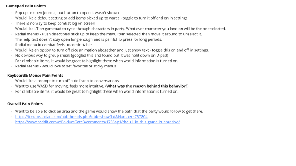
On a new playthrough, there were a few things that stood out on game pad that I hadn’t experienced on mouse and keyboard:
- When trying to open the journal, a modal popped up, but the button to access it was missing.
- The radial menus were tricky to navigate and felt uncomfortable to use.
- Also, finding the group sneak option was far from straightforward—I ended up having to look it up online.
These problems made using the gamepad feel clunky and frustrating, often driving players to switch to mouse and keyboard or, in some cases, even give up on the game.
Keyboard and mouse appeared to have less troubles, but digging through sites like Baldur’s Gate 3 Subreddit and Larian’s own forum there are still some things to be addressed:
- Using the WASD keys for moving around the map feels much more intuitive.
- Some of the UI elements are a bit confusing or overwhelming.
- Navigating the inventory can be quite frustrating.
card sort
With a game as vast as Baldur’s Gate 3, keeping information organized can make a big difference in the player experience. I opted for a card sort approach to group player actions into categories. A card sort is a hands-on method in UX/UI design where I organize information in a way that makes sense. By grouping items into logical categories, it helps make everything more digestible and user-friendly.
Scenario Categories
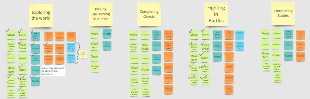
To get a good handle on player actions I put them into over-arching categories. With those categories in mind, I was able to effectively sort each player action into various scenarios a player will execute while in game. These categories were a huge help in determining the best player experience for each scenario.
Desk Research
Once I had a clear idea of where to focus from the card sorting, I jumped into some desk research. I started by checking out how other games handle similar issues and got some quick feedback from social media.
Competitive Analysis
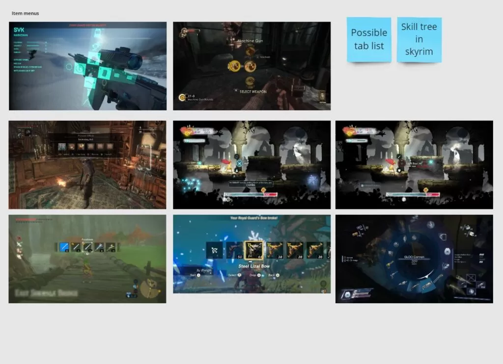
Social Media Interviews
I always make a point to check out other games for inspiration and to see what might or might not work for my project. For this case, I was looking into item menus to find the best patterns for gamepad controls.
wireframes
looting containers
Original Pattern For Looting - Mouse & Keyboard
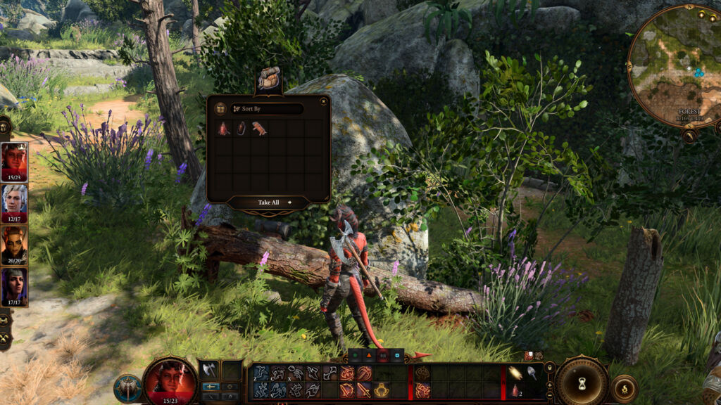
Original Pattern For Looting - Gamepad
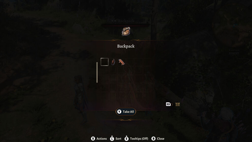
Re-designed Pattern For Looting - Mouse & Keyboard
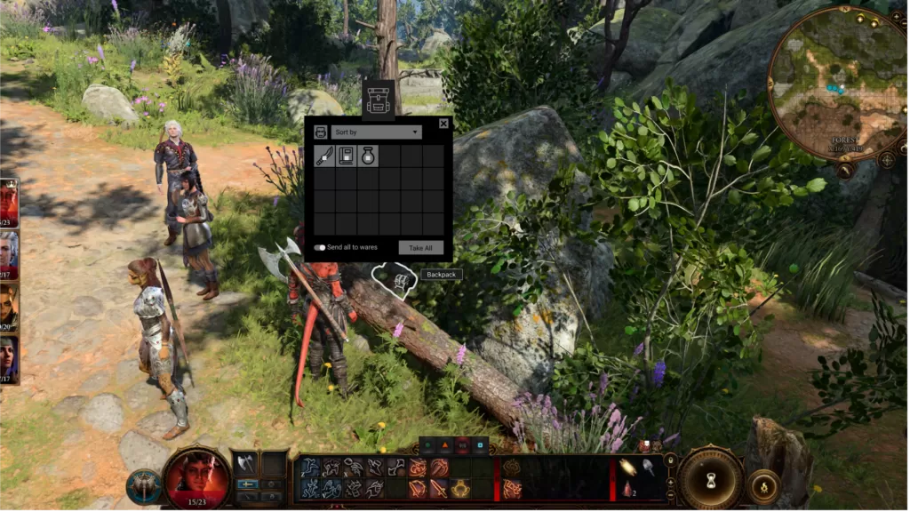
Re-designed Pattern For Looting - Gamepad
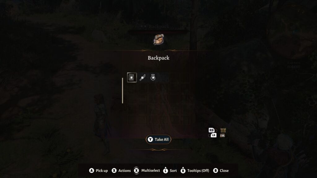
- There’s no easy way to mark items for sale quickly.
- Once you’ve put items into the wares category, you can’t change your mind without going back into your inventory.
The redesign focused on improving the player experience. While I kept the overall pattern familiar, I added some quality-of-life improvements. Here’s what I introduced:
- A toggle to instantly send all items to wares, with the items marked directly in the container.
- A more straightforward sorting menu at the top of the modal.
These small tweaks will make a huge difference, helping players quickly loot containers and get back to their adventure.
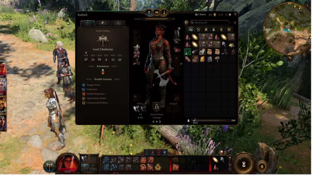
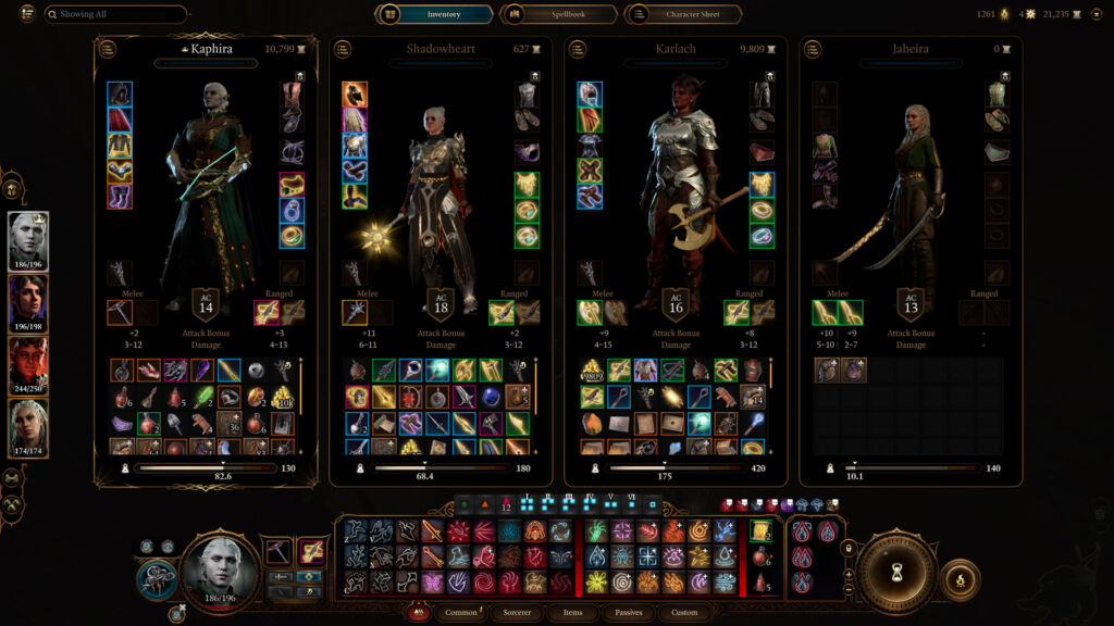
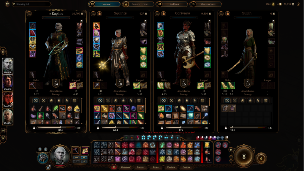
inventory management
Original Pattern Single Character Inventory - Mouse & Keyboard
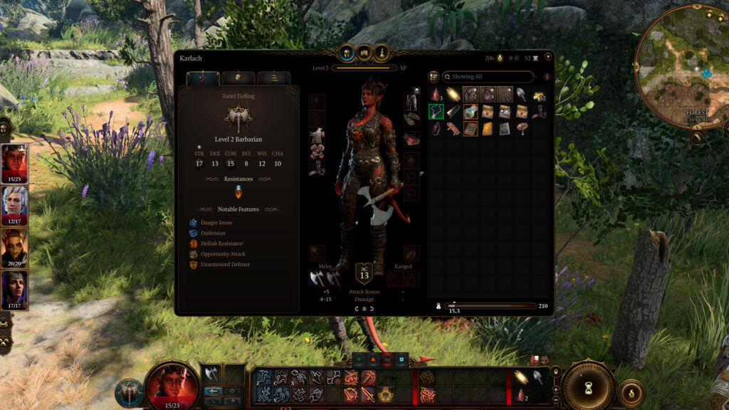
Original Pattern For Team Inventory - Mouse & Keyboard
Re-designed Pattern For Single Character Inventory - Mouse & Keyboard
Redesigned Pattern For Team Inventory - Mouse & Keyboard
By the time you reach the late game, there’s one boss battle that befuddles most of us, and that’s inventory management. In a game as huge as this, it’s essential that both individual and team inventories are easy to use and navigate. Here are a few areas that needed some extra attention:
- The filters only sort by weight or most recent, missing more detailed visual cues for item types.
- Items marked for sale tend to get lost in the clutter, making the inventory feel messy.
- Plus, it’s tough to spot which items you just picked up.
I wanted to tackle these issues in a way that would make the most sense visually and intuitively, yet not take away too much from the original pattern. Here’s what I proposed:
- A toggle to show or hide items marked for wares. This will help declutter the inventory in late-game.
- Tabs with item categories. Having these visual queues will help players sort through their inventory when they’re looking for something quickly.
- The team view also has category tabs that allow users to find and move items to other characters easily.
The idea behind these changes is to help you find specific items faster, without having to scroll endlessly. This way, you can quickly get to what you need and get back to your tasks.
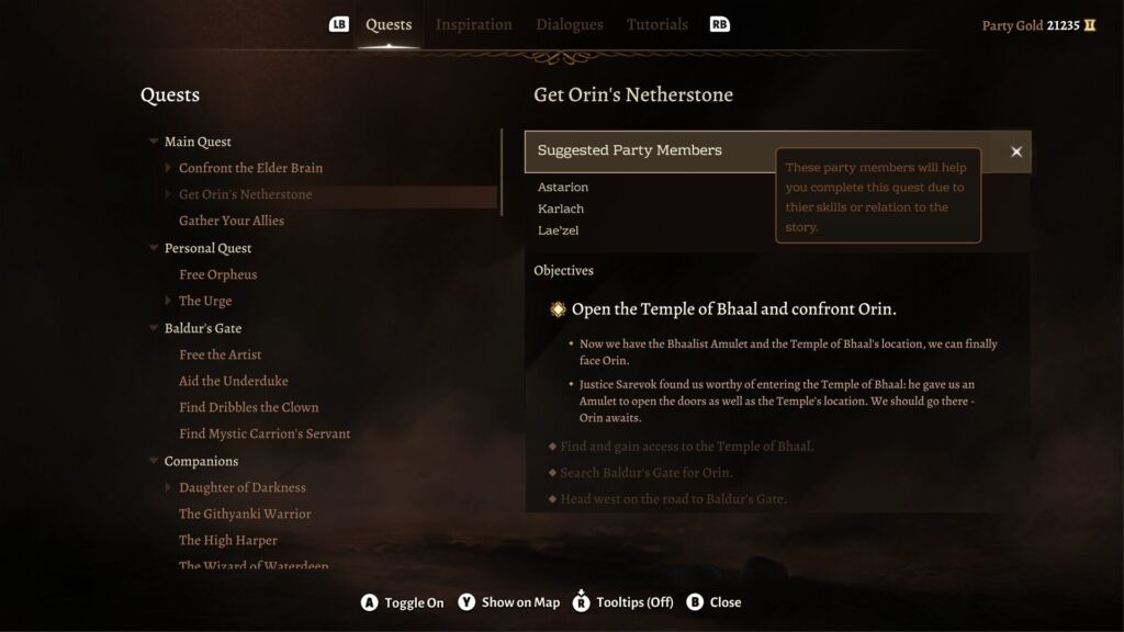
party suggestion
Party Suggestion In The Quest Journal - Gamepad
Party Suggestion On The Map - Mouse & Keyboard
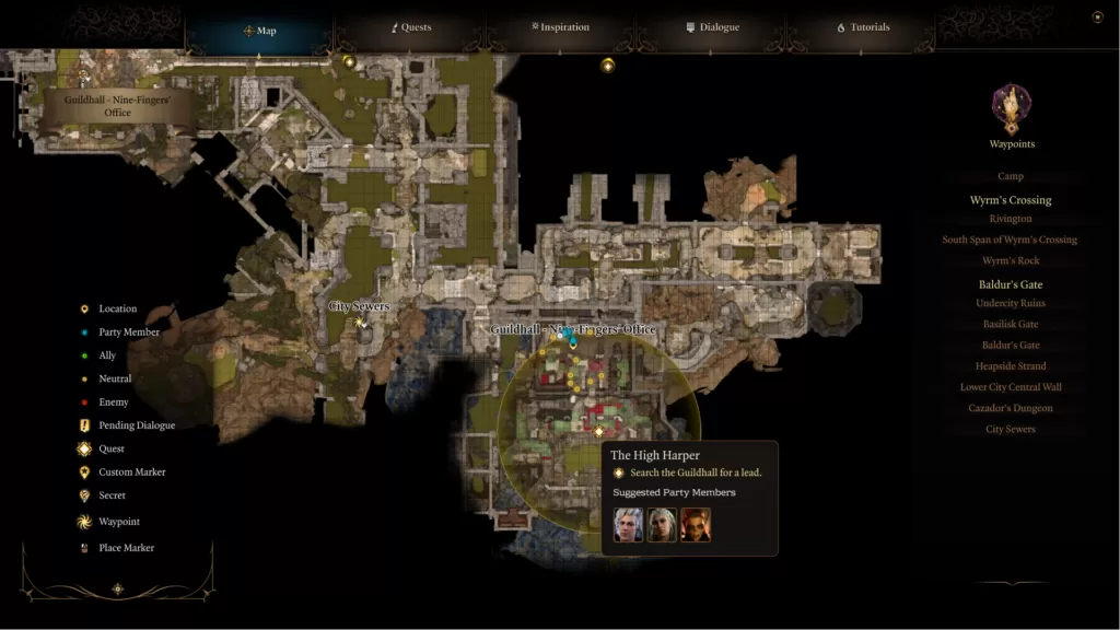
Larian wanted to add a feature that suggests which party members might be best for a quest. I loved this idea, especially if you’re still figuring out your party’s abilities and aren’t sure who to bring along. Let’s explore how this feature works:
- In the journal, each quest will have a list of suggested party members you can swap in.
- You can hover over each suggestion to see why they’re recommended.
- Swapping party members can only be done at camp, with the option disabled elsewhere, though you’ll still see the suggested names in the game world.
- When you click the checkbox to ‘Replace,’ you’ll get a confirmation prompt before the party is updated.
- On the map, hovering over quest markers will show you the quest name and suggested characters.
- To keep things clear for different languages, we’re using images on the map instead of text.
This setup will make it easier for players to pick the right party members for each quest. For newcomers to the genre, managing lots of characters can be a bit daunting, so this guide will help them ease into it and make the experience more enjoyable.
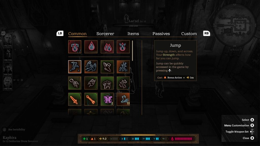
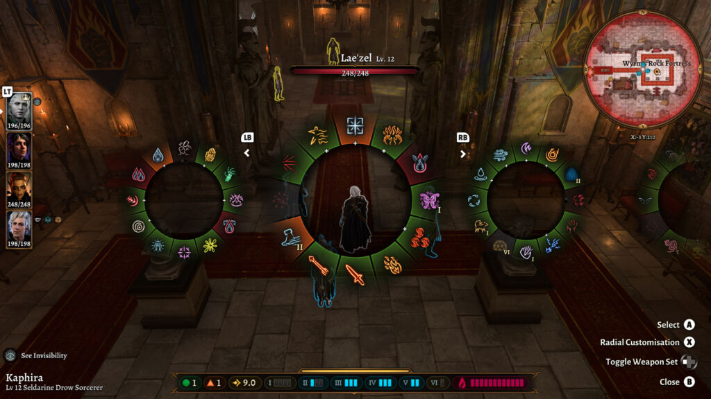
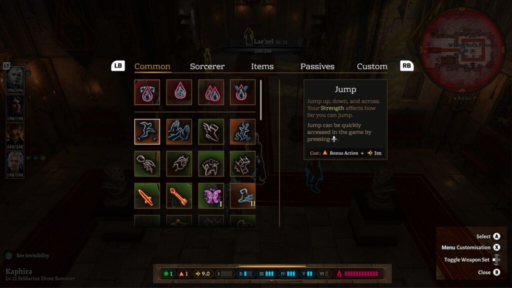
combat menu
Original Combat Menu - Gamepad
Re-designed Pattern For Combat Menu - Gamepad
Combat is a huge part of Baldur’s Gate 3, so it’s important that it feels intuitive across all platforms to keep players from getting frustrated. Designing for both mouse/keyboard and gamepad can be tricky because of the different number of buttons. Radial menus can be helpful, but once you’re deep into the game and juggling a lot of abilities, they can become cumbersome. Here are some things I noticed during the playtest:
- In the late game, sorting through abilities can get really tricky.
- Using the directional stick to select abilities often feels awkward and might even be uncomfortable for players with arthritis.
- The meaning of the colored backgrounds isn’t very clear.
For my redesign, I went with a classic grid layout for the menu, making it simpler to navigate through sections with the bumper buttons on the controller. Here are some of the key features:
- When a player selects a spell with multiple levels, they’ll be taken to a new page where they can see all the levels available.
- To get back to the main menu, just press the B button.
- “Extra” abilities that boost other spells will appear in the top row and stay consistent across the related categories. For example, you’ll see Metamagic listed here.
- This will work much like the Mouse and Keyboard setup, with the outer frame glowing or animating to show which spells can be affected.
